TMD Inspiration
Common Design Mistakes and How to Avoid Them
Categories
Recent Articles
GET IN TOUCH
On social
By phone
202 465-8114
By Mail
1350 Beverly Road, Suite 115
PMB 143
McLean, VA 22101
By form
Interested in working with us?
Use the contact form to tell us more about your project. Someone will get back to you within 48 business hours.
Based in McLean, VA
Creating inspired interiors for discerning clients since 2003. Accepting clients in DC, Virginia, Maryland, and select cities throughout the United States.
Common Design Mistakes and How to Avoid Them
 Does your living room seem cramped and chaotic? Is your bedroom room dark and cluttered? In this article, we take a look at a couple of common design mistakes and how to avoid them. Remember – a few small design tweaks can make all the difference.
Proportion & Layout are Everything
Unfortunately, sometimes the sofa that looked perfect on the showroom floor or in the catalog is too large to fit into the front door of your home. Or the dining table for eight looks miniature in your large dining room. Before you throw out your furniture, try these simple suggestions:
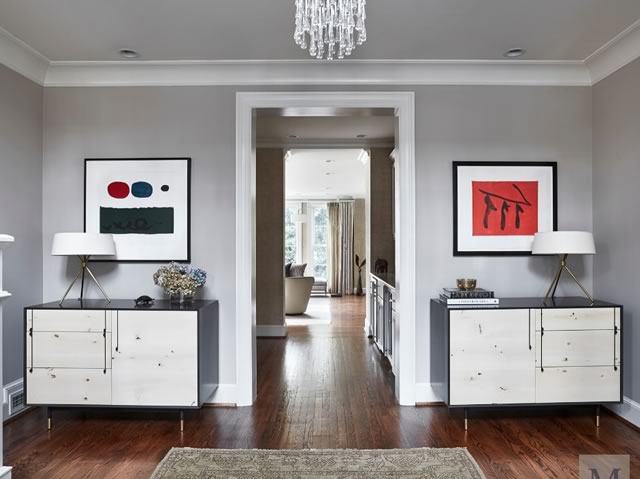
- Many people try to make a room look bigger by pushing furniture up against the wall. This can actually make the room feel like a tighter squeeze. Furniture generally looks much better pulled away from the edges of a room.
- When furnishing smaller spaces, choose pieces that are streamlined in terms of shape (not necessarily smaller in scale). Consider the depth of the chair or couch. Does it fit with the proportions of your room?
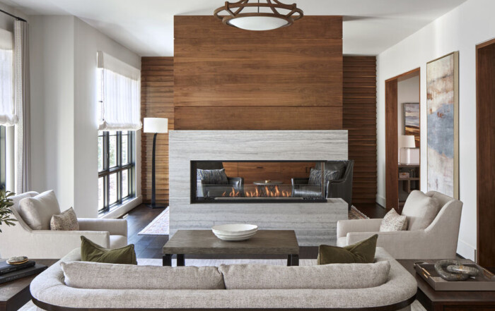
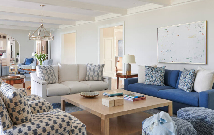
- If your room is large, consider creating several groupings of furniture. For example, sofas opposite each other will allow family member/guests to comfortably engage in conversation. Add a comfortable settee in the corner (with a side table) in the same room for a cozy sitting area.
Solution: Love your tape measure. By checking – and rechecking – your measurements thoroughly, you can avoid disasters or common design mistakes such as the furniture not fitting through the door. It will also give you insight into how your chosen pieces will fill the space. When you work with Tracy Morris Design, we routinely create computer-aided design (CAD) layouts and provide our clients with floor plans and client packets (with information including fabric, furniture, and tile choices).
The Magic of Lighting
Lighting is one of the most essential elements in a home. However, homeowners often complain of not enough lighting or lighting in the wrong place. Here are some remedies to common lighting issues:
- If the lighting in a room feels “uncomfortable,” try layering different types of lighting including ambient (overall, general lighting), task (designed for a specific function such as reading or cooking), and accent (used to highlight or decorate a space).
- Sometimes the lighting fixture doesn’t fit the room. Just like furniture and accessories, a fixture not only needs to fit your décor but also the scale of the room in which it is being installed and used.
- Make sure you are choosing the right bulb for the occasion. Things to consider include the bulb’s color rendering index (CRI), the color temperature, and the lumens. We always recommend using bulbs with a temperature of 2700K. If the number is higher it gives a blue-toned LED light that makes the space feel cold.
Solution: Don’t overlook the importance of good lighting. The way in which it is incorporated into home design adds elegance, sophistication, and style to any room. Please see my article Choosing and Installing the Perfect Lighting in Your Home for more tips. For more ways to avoid common design mistakes, please contact me.


