TMD Inspiration
Color Theory in Home Design
Categories
Recent Articles
GET IN TOUCH
On social
By phone
202 465-8114
By Mail
1350 Beverly Road, Suite 115
PMB 143
McLean, VA 22101
By form
Interested in working with us?
Use the contact form to tell us more about your project. Someone will get back to you within 48 business hours.
Based in McLean, VA
Creating inspired interiors for discerning clients since 2003. Accepting clients in DC, Virginia, Maryland, and select cities throughout the United States.
Color Theory in Home Design
 Picking a paint color for your home design can be an intimidating process when redecorating your home. Finding the right color that fits your home is important because color choices play a key role in the overall environment of a home. Colors can influence moods, feelings and even increase how much sleep you get.
When it comes to picking colors for your home, it’s helpful to have a basic knowledge of color theory. What is color theory? Color theory involves the study of hues and how to use them in harmony. In this article, I will break down the basics you need to know.
Color Wheel
When he first discovered the visible spectrum of light in the 17th century, Sir Isaac Newton presented the first color wheel. In the color wheel, there are three different types of colors: primary, secondary, and tertiary.
- Primary, also considered beginning or starters colors, hues are red, yellow, and blue.
- Secondary colors are mixtures of primary colors, namely green, orange, and purple.
- Tertiary colors are the result of mixing one primary and one secondary color.
Now that we’ve discussed the basics of the color wheel, let’s dive into how you can apply this theory while choosing paint colors. The objective when choosing a color is to have each area of the home flow easily and seamlessly to create a cohesive decorating scheme and a natural calming balance. If the different rooms in your home have different palettes, the overall impact can be unsettling.
Harmonies in Home Design
This brings us to harmonies, which are used to determine which color combination works well, based on the relationship hues have with one another on the color wheel. Let’s look at the most popular types:
- Monochromatic – a single color broken out into different values.
- Analogous – a small group of colors that neighbor each other on the wheel.
- Complementary– two hues that sit directly opposite on the wheel.
- Split-complementary – a trio where one sits opposite two hues that neighbor its complement.
- Triadic – three colors that are equidistant from one another on the color wheel.
- Tetradic (Double-complementary) – 2 pairs of complementary colors.
Pick Your Tone
Selecting the tone is another important step in home design. Most hues fall into one of two tones:
- Warm: red, pink, orange, and yellow.
- Cool: blue, indigo, purple, and green.
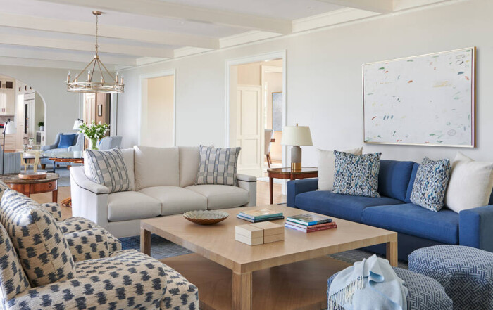
In order to build an attractive theme, you would need to choose a warm or a cool palette, sticking to colors only within this scheme. For example, if you choose cool tones, you can paint your walls with a soft, light blue and paint the trim white. A warm palette might have a brighter color like peach, for instance.
You can also mix and match neutral hues like beige or white. They have undertones, like yellow, pink, or blue, so choosing one with an undertone that matches or contrasts with other elements will take the look of your walls to another level.
Characteristics
It all comes down to what characteristics people associate with a hue. Choosing your palettes carefully is important for communicating the characteristics or mood you want to set.
- Red: ambitious, bold, powerful, passionate, active.
- Orange: instinctive, optimistic, extroverted, charismatic.
- Yellow: energetic, joyous, friendly, spontaneous, fun.
- Green: growth, prosperous, hopeful, restorative, generous.
- Blue: content, responsible, intelligent, authoritative, controlled.
- Purple: creative, fanciful, distinguished, compassionate, devoted.
- Black: confident, elegant, mysterious, commanding, judicious.
- White: wise, pure, honest, innocent, influential.
Balance in Home Design
Balancing your palette is necessary to set an appealing space. What do I mean by balance? For example, you can choose a neutral color as the dominant to fill about 60 percent of the space. Then, select a secondary and accent hue. A secondary color should fill about 30 percent of the room while accents should take about 10 percent.
Please see my recent articles TMD’s Guide to Neutral Paint Colors and Paint 101: Choosing the Correct Interior Paint Color and Finish for more information about choosing the perfect colors for your home design.


